7 Color Palettes for Luxury-Themed Lifestyle Apartments
Luxury lifestyle apartments are increasingly popular, and the right color palette can transform any space into an opulent sanctuary. From the psychology of color to the latest trends, we will explore seven sophisticated color palettes that can elevate the aesthetic of any luxury apartment.
Table of Contents
- Introduction
- Key Takeaways
- Palette 1: Modern Monochrome
- Palette 2: Earthy Elegance
- Palette 3: Bold and Gold
- Palette 4: Oceanic Opulence
- Palette 5: Royal Radiance
- Palette 6: Contemporary Contrast
- Palette 7: Pastel Posh
- Frequently Asked Questions (FAQs)
Key Takeaways
✔ Modern Monochrome: A single-color scheme that brings sophistication through a spectrum of shades, providing a sleek and timeless look to apartments.
✔ Earthy Elegance: This palette infuses apartments with warmth and organic harmony, drawing inspiration from nature’s muted and rich tones.
✔
Bold and Gold: A daring combination that infuses apartments with the opulence of gold and the energy of bold colors for a luxurious statement.
✔
Oceanic Opulence: Cool blues and greens mimic the serene beauty of the sea, bringing a tranquil and luxurious ambiance to apartments.
✔
Royal Radiance: Majestic purples and sophisticated metallics converge to give apartments a regal and luxurious atmosphere.
✔
Contemporary Contrast: The stark contrast of black and white, accented with strategic color pops, creates a modern and dramatic effect in apartments.
✔
Pastel Posh: Soft pastel hues offer a chic and understated elegance, creating a light, airy, and luxurious feel within apartments.
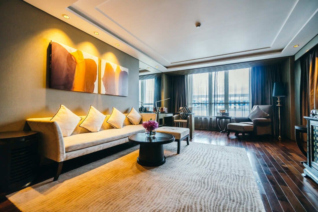
Palette 1: Modern Monochrome
The Modern Monochrome palette is a testament to the power of simplicity in luxury apartment design. It's a timeless choice for apartments that cater to those with a penchant for understated elegance and a minimalist approach. In high-end residences like The Millennium, the monochrome palette stands out for its sophistication and versatility.
Essence of Monochrome in Luxury Apartments
Monochrome, in the context of apartment design, refers to the use of a single color in varying shades and tones. It's about exploring the full spectrum of one hue, from the palest tint to the darkest shade. This approach creates a cohesive and serene environment that is as stylish as it is soothing. Luxury apartments benefit from this palette because it offers a seamless aesthetic that can be both dramatic and subtle.
- Harmony and Flow: In luxury apartments, a monochrome palette ensures that rooms flow together harmoniously, creating a sense of continuity and space.
- Visual Cohesion: Using different shades of the same color unites diverse design elements, from furniture to wall treatments, under one elegant theme.
- Sophistication: A monochrome scheme speaks to a sophisticated lifestyle, appealing to those who appreciate design that makes a quiet yet confident statement.
- Versatility: This palette serves as a perfect backdrop for highlighting other architectural features of apartments, such as high ceilings or large windows.
- Timelessness: Monochrome is timeless. It transcends trends, ensuring that apartments retain their stylish edge year after year.
Palette 2: Earthy Elegance
Earthy Elegance is a palette that brings the outside in, creating a sanctuary of tranquility and warmth within the luxury apartment space. It's inspired by the colors of nature — the deep browns of the soil, the varied greens of foliage, and the muted tones of stones and minerals. For apartments in Hartford, CT, like those in The Millennium, this palette draws from the natural world to craft an environment that's both refined and inviting.
Warmth of Nature in Urban Apartments
Luxury apartments can serve as a personal retreat. The Earthy Elegance palette relies on a spectrum of natural tones that evoke a sense of calm and grounding, making apartments feel more like homes.
- Rich Textiles: To enhance the earthy palette of an apartment, integrate textiles like chunky knits, nubby linens, and soft leathers that invite touch and add warmth.
- Organic Elements: Incorporating elements like wood grains, stone surfaces, and terracotta can introduce subtle variations within the earthy palette.
- Layering Rugs and Throws: Area rugs and throws in natural fibers add layers of texture and comfort to an apartment, making it feel more welcoming.
- Handcrafted Accessories: Decorative items with a handcrafted appeal, like pottery and baskets, can add personality and depth to the earthy elegance of an apartment.
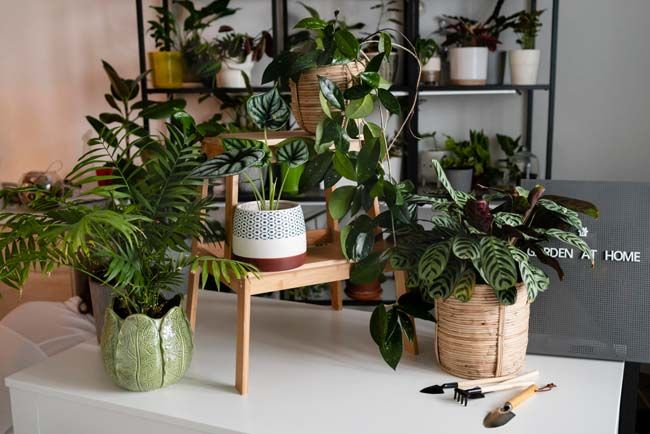
- Floral and Plant Accents: Adding plants and floral arrangements can bring a living element to apartments, enhancing the connection to nature and providing a pop of color.
Palette 3: Bold and Gold
The Bold and Gold palette is an unapologetic celebration of luxury and confidence, a perfect fit for the high-end apartments of discerning residents. It combines the richness of gold with bold hues to create a visually stunning environment that exudes sophistication. This palette promises to make a statement that resonates with opulence and grandeur.
Daring Aesthetics in Luxury Apartments
The fusion of bold colors with the lustrous sheen of gold can transform apartments into spaces that not only reflect high-end taste but also a daring personality. It’s a palette that’s meant to impress, creating an ambiance that’s both lavish and vibrant.
- Focal Features: Use gold as a focal point in apartments, such as a statement piece of furniture or a prominent light fixture, to draw the eye and add a sense of luxury.
- Accent Details: Small touches like gold drawer pulls, picture frames, or decorative objects can infuse apartments with a subtle yet impactful hint of opulence.
- Artistic Touches: Gold leaf in art pieces or frames can serve as a sophisticated addition to apartments, marrying artistry with luxury.
- Textural Elements: Incorporate gold in various textures, such as brushed, polished, or hammered finishes, to add depth to the apartments' interiors.
- Layering: Pair gold with varying shades of the same bold color within apartments to create a rich, layered look that’s visually interesting and luxurious.
Palette 4: Oceanic Opulence
The Oceanic Opulence palette draws from the serene and majestic colors of the sea to bring a sense of calm and luxury to apartments. This color scheme, with its soothing blues and invigorating greens, is reminiscent of the ocean's depths and the tranquility of its rhythmic waves. It's particularly well-suited for luxury apartments in Hartford, CT, such as those in The Millennium, where the aim is to create a living space that serves as a peaceful retreat from the busy city life.
Serenity Meets Luxury in Apartment Design
Utilizing the Oceanic Opulence palette within apartments can create a space that is not only visually stunning but also emotionally soothing. The colors of the sea have a naturally calming effect, making them an ideal choice for a luxury apartment setting where comfort meets elegance.
- Depth of Color: Incorporating varying shades of blue can give apartments a sense of depth and fluidity, much like the ocean itself.
- Tranquil Atmosphere: The right blend of blues and greens can transform apartments into tranquil havens, ideal for relaxation and peace.
- Natural Light Play: These oceanic hues work well with natural light, which can enhance the feeling of openness and airiness in apartments.
- Luxurious Textures: Combine these colors with luxurious textures like silk and velvet to add a touch of opulence to the calming palette.
- Dynamic Accents: Introducing metallic accents, such as brushed nickel or silver, can add a dynamic contrast to the cool tones, reminiscent of sunlight dancing on water.
Palette 5: Royal Radiance
Royal Radiance is a palette that exudes sophistication and luxury, drawing inspiration from the deep, rich purples and lavenders that have adorned the halls of royalty for centuries. For apartments in Hartford, CT, this palette adds a layer of majestic elegance, transforming any space into a regal abode fit for modern-day kings and queens.
Regal Ambiance in Modern Apartments
The use of purple in an apartment's color scheme can infuse a sense of luxury and opulence that is both timeless and contemporary. It's a bold choice that communicates confidence and sophistication, making it an ideal choice for luxury apartments aiming to stand out with a distinct character.
- Strategic Lighting: Use lighting to highlight the luxurious elements of your apartment, with a focus on areas that feature the royal palette.
- Furniture Selection: Choose furniture that has a classic and elegant design to match the royal theme in apartments, with ornate details and plush fabrics.
- Luxury in Details: Incorporate luxurious details such as gold trim, embroidered cushions, and intricate rugs to enhance the royal feel of apartments.
- Harmonious Blending: Blend the Royal Radiance palette smoothly with the apartment's architecture and layout to ensure that the design feels intentional and harmonious.
- Personal Touches: Personalize your apartment with unique touches that reflect your taste while staying true to the royal theme, making the space truly your own.
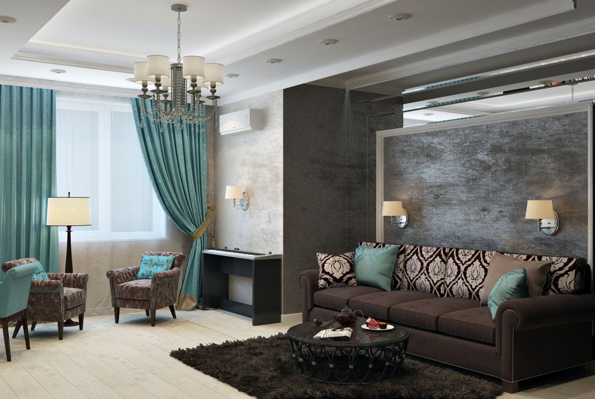
Palette 6: Contemporary Contrast
Contemporary Contrast is a visually striking palette that plays on the powerful dynamic between light and dark, simplicity and drama. For luxury apartments in Hartford, CT, such as The Millennium, this high-contrast scheme of black and white punctuated with strategic pops of color provides a bold statement that is both timeless and modern.
Boldness of Contrast in Apartment Design
A high-contrast palette in apartments often combines stark black and white elements to create a visually stimulating environment. It's a style that speaks of sophistication and refinement, embodying a fearless approach to apartment living where design is as important as functionality.
- Personality: Introducing pops of color to apartments can infuse personality and vibrancy into the space, reflecting the inhabitants' tastes.
- Focal Points: Use color judiciously to create focal points in apartments, such as a brightly colored accent wall or a piece of statement furniture.
- Balance and Harmony: Ensure that the color additions to apartments are balanced and harmonious, complementing rather than competing with the black and white base.
- Seasonal Updates: The versatility of a high-contrast palette in apartments allows for easy updates with different color accents as seasons change.
- Art and Accessories: Utilize art, cushions, rugs, and other accessories to bring in color, which can be easily changed out to refresh the apartment's look.
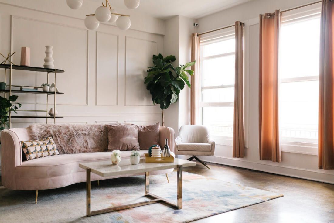
Palette 7: Pastel Posh
The Pastel Posh palette brings a subtle elegance to luxury apartments, offering a soft yet sophisticated color scheme that is both refreshing and contemporary. This palette, with its muted hues and soft tones, is perfect for creating a calming oasis within the urban environment of Hartford, CT. It's a design choice that provides a gentle nod to luxury living while maintaining a light and airy feel.
Elegance of Pastels in Apartments
Pastel colors are known for their ability to bring a sense of serenity and spaciousness to apartments. When used in luxury apartment settings, they create a chic and upscale ambiance that is both welcoming and stylish.
- Plush Comfort: Add plush textiles like thick carpets and soft throws to apartments to balance the softness of the pastel colors with a sense of comfort.
- Coherent Themes: Develop a coherent theme in apartments using pastel colors that carry through from room to room, creating a seamless transition throughout the living space.
- Accent Pieces: Use accent pieces like cushions, lamps, and decorative items in bolder shades to provide contrast and interest in pastel-dominated apartments.
- Quality Materials: Choose high-quality materials for furniture and finishes in apartments to ensure that the pastel colors are grounded in luxury.
- Subdued Elegance:
Maintain a level of subdued elegance in apartments by avoiding overly bright or neon accents that can clash with the pastel palette.
Frequently Asked Questions (FAQs)
What are the best color palettes for smaller apartments to make them appear larger?
For smaller apartments, light and bright color palettes work wonders in making spaces appear larger. Cool colors like blues and greens can visually recede, making walls seem farther away and rooms feel more expansive. Off-whites, light grays, and pastels can also create an airy feeling, amplifying the natural light in the apartment.
How do I choose a color palette that reflects my personal style in an apartment?
Your apartment's color palette should be a reflection of your personal style and the feelings you wish to evoke in your living space. Consider your favorite colors, artworks, and fashion preferences as a starting point. Then, look for a cohesive palette that incorporates these elements, perhaps using them as accent colors or decorative accessories.
Can color palettes in apartments affect my mood?
Yes, color palettes in apartments can significantly affect your mood. Colors have psychological effects; for example, blues and greens are typically calming and serene, while yellows can be energizing and uplifting. Consider what mood you want to cultivate in your apartment and choose your palette accordingly.
What are some tips for incorporating the latest color trends into my apartment?
To incorporate the latest color trends into your apartment, you can start with small, easily changeable elements such as throw pillows, art, or an accent rug. This way, you can stay up-to-date without committing to a complete redesign. Always balance trends with timeless elements for a more enduring style.
How do I ensure the colors I choose for my apartment will not quickly go out of style?
To ensure the colors in your apartment remain stylish over time, opt for a neutral base with classic colors that have stood the test of time. You can then introduce trendy colors in small doses. Neutrals don't compete with flashes of color and can make transitioning through trends seamless.
What's the best way to test a color palette in my apartment before committing?
The best way to test a color palette in your apartment is to get samples and observe how they look at different times of day and under various lighting conditions. You can also use digital tools or apps that allow you to upload photos of your apartment and apply different colors to see potential outcomes.
How can I balance multiple colors in one apartment space without it feeling overwhelming?
To balance multiple colors in one apartment space without overwhelming it, stick to one or two dominant colors and use others as accents. Ensure there's enough neutral space to give the eye a place to rest. Also, use colors of similar saturation to maintain harmony.
What are some considerations for choosing a color palette in an apartment with an open floor plan?
In an apartment with an open floor plan, your color palette should create a sense of unity across the space. Choose a base color that will flow throughout the apartment, and then define different areas with accent colors or variations of the base hue. This creates diversity without visual chaos.
Can I use dark colors in my apartment, and how do I do it without making the space feel small?
You can use dark colors in your apartment even if you're concerned about space. The key is to use dark colors as accents or on a feature wall, balanced with lighter colors on other walls and surfaces. Good lighting and reflective surfaces can also counteract the potential for dark colors to make a space feel smaller.
How do I incorporate a bold color into my apartment without it overpowering the space?
To incorporate a bold color without overpowering the space, use it sparingly and purposefully. Consider bold colors for accent walls, textiles, or as part of a gallery wall. Pairing bold colors with neutral tones can also ensure they stand out without dominating the apartment's overall aesthetic.
Discover Timeless Luxury With a Splash of Color at The Millennium
Are you ready to infuse your life with color and luxury? The Millennium apartments await, offering the perfect backdrop for your design aspirations. Whether you're drawn to the boldness of contrasting shades or the subtle elegance of pastels, our apartments are a blank canvas for your imagination. Contact us today to schedule a visit!